Sneak Peek: Todoist's New Look
Todoist Redesign Coming Soon
11 Apr 2025
Todoist hasn't had too many redesigns in their over 10 year history, but Todoist CEO Amir wants it to be sleeker and cleaner. Let's explore their upcoming redesign.
Todoist CEO Amir Salihefendic wants a cleaner look to Todoist. With an already clean and simple approach to Todoist, they want to go even sleeker in feel and approach. After a flurry of tweets, the team want to continue to refine the experience and their upcoming changes look nice and simple for current and new users of Todoist.
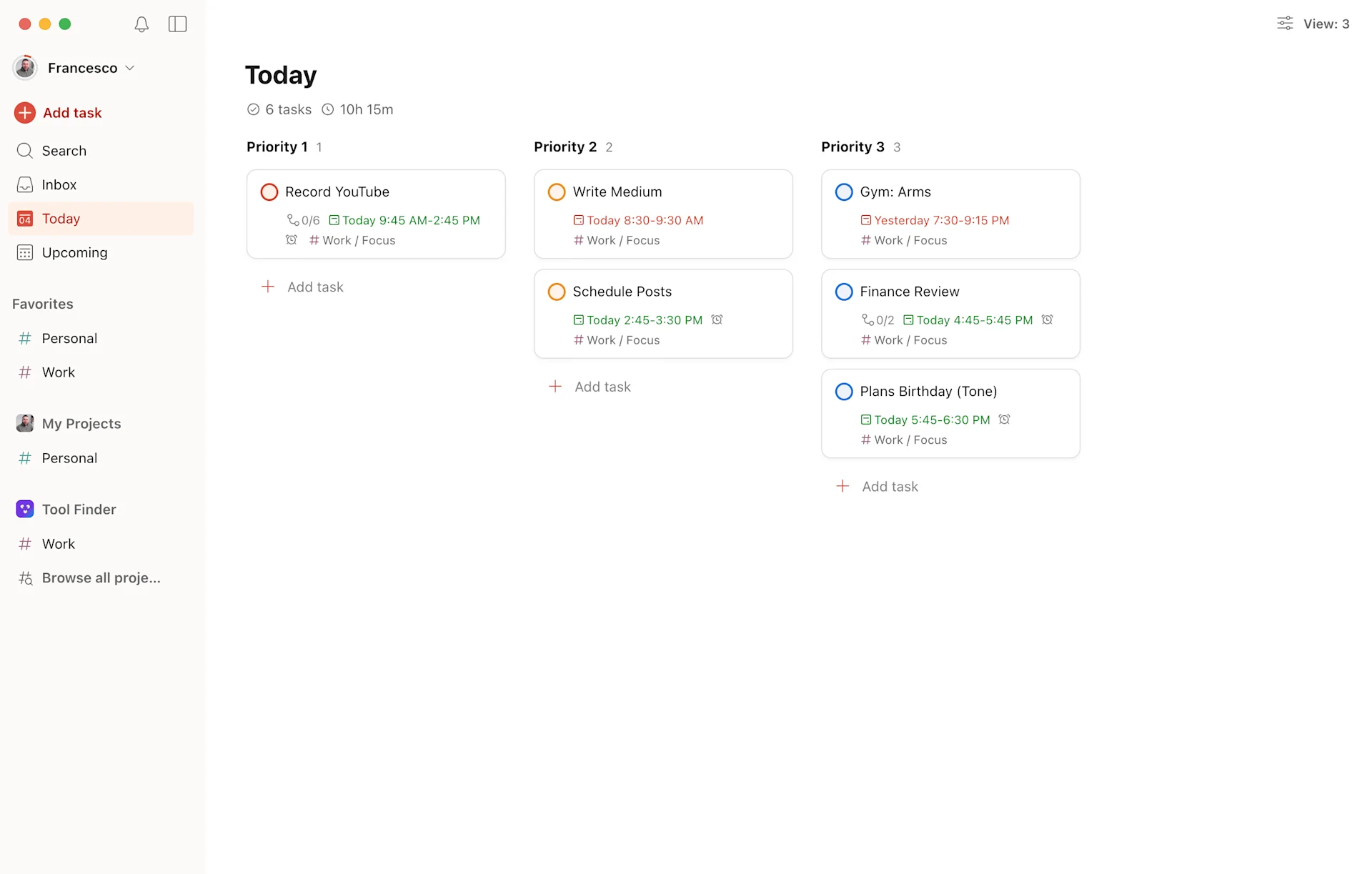
This is the Twitter thread from Todoist CEO for a source. Here's the new look overview:
Before we commence, let's just explore the newer elements. These will just help you understand what major elements are new in the upcoming redesign.
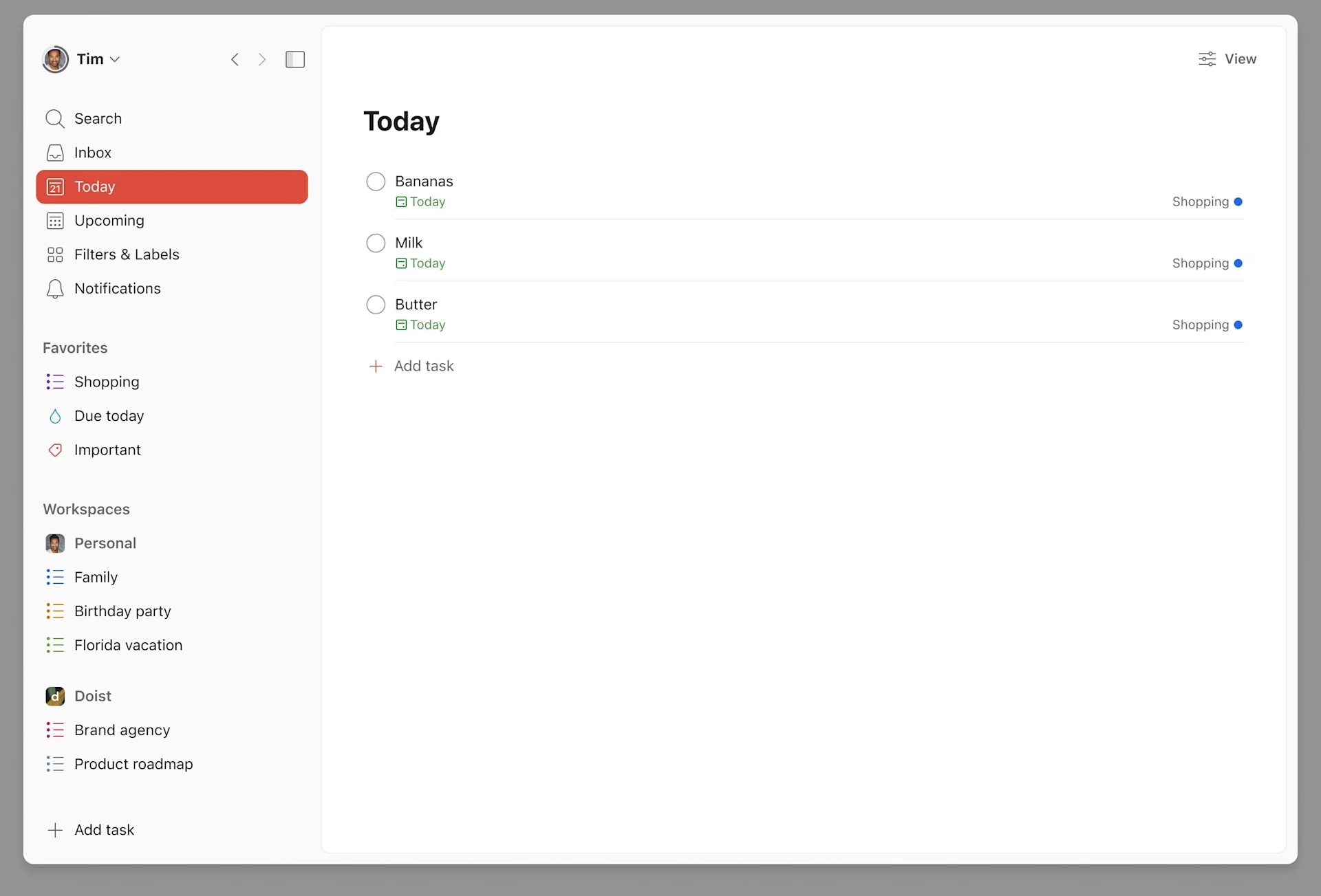
1. Workspaces
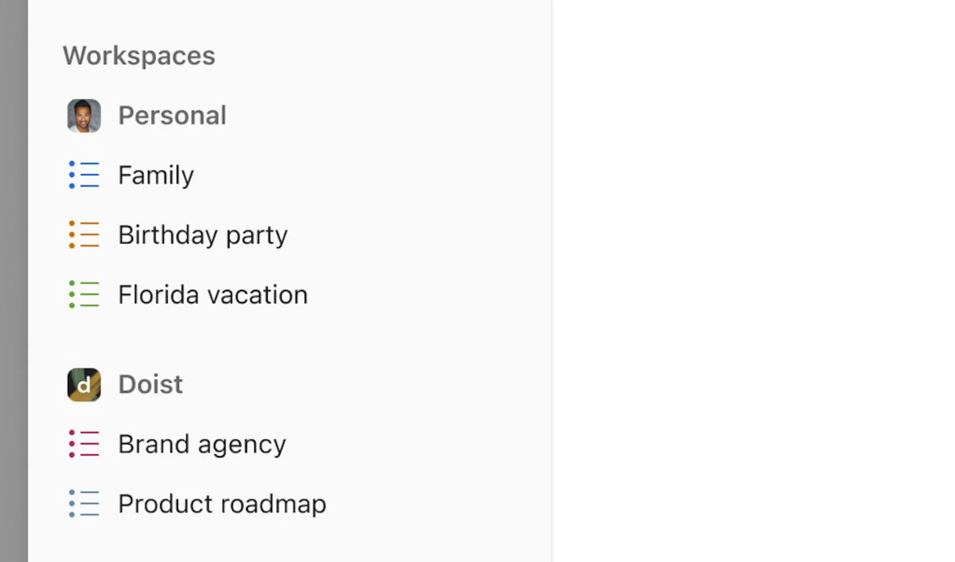
The new workspace areas make it easier for Todoist Team users to see what's going on in all their accounts, with their projects in mind too. This is much more like a project management style approach but makes it feel more consistent for users of both.
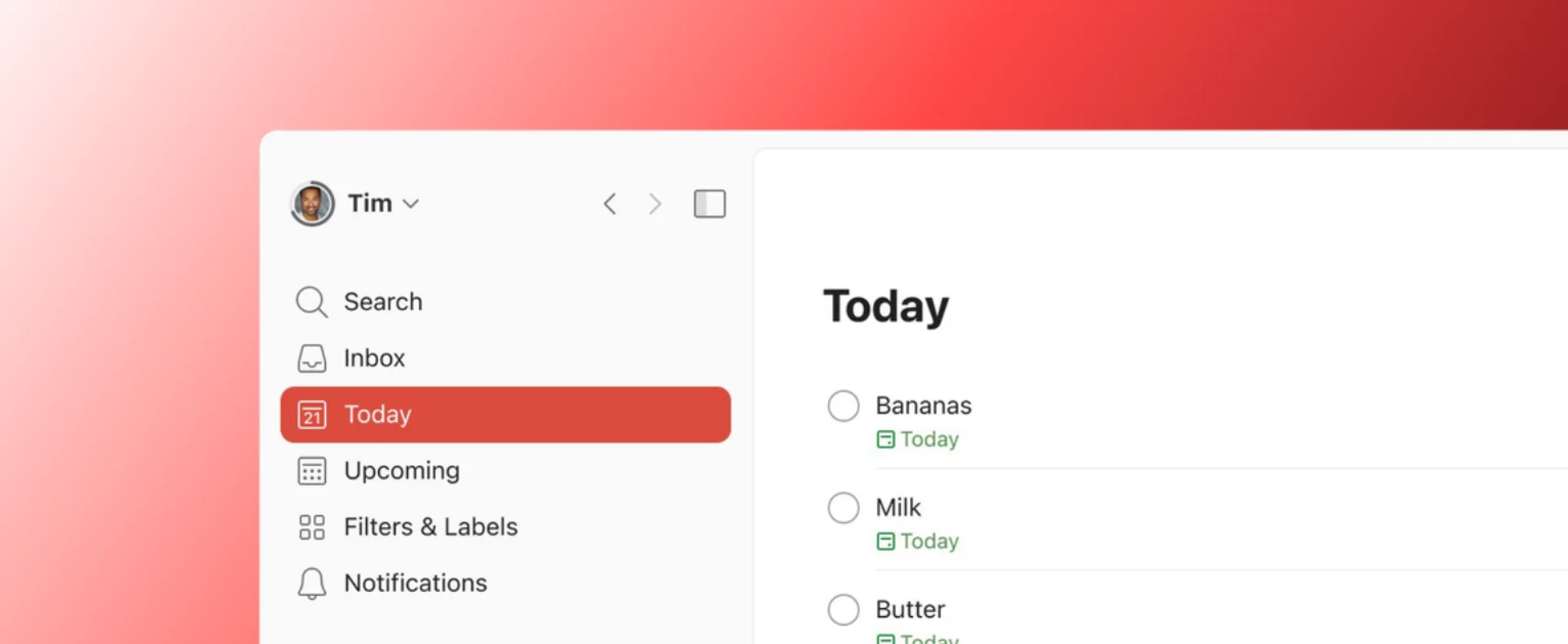
2. Sidebar
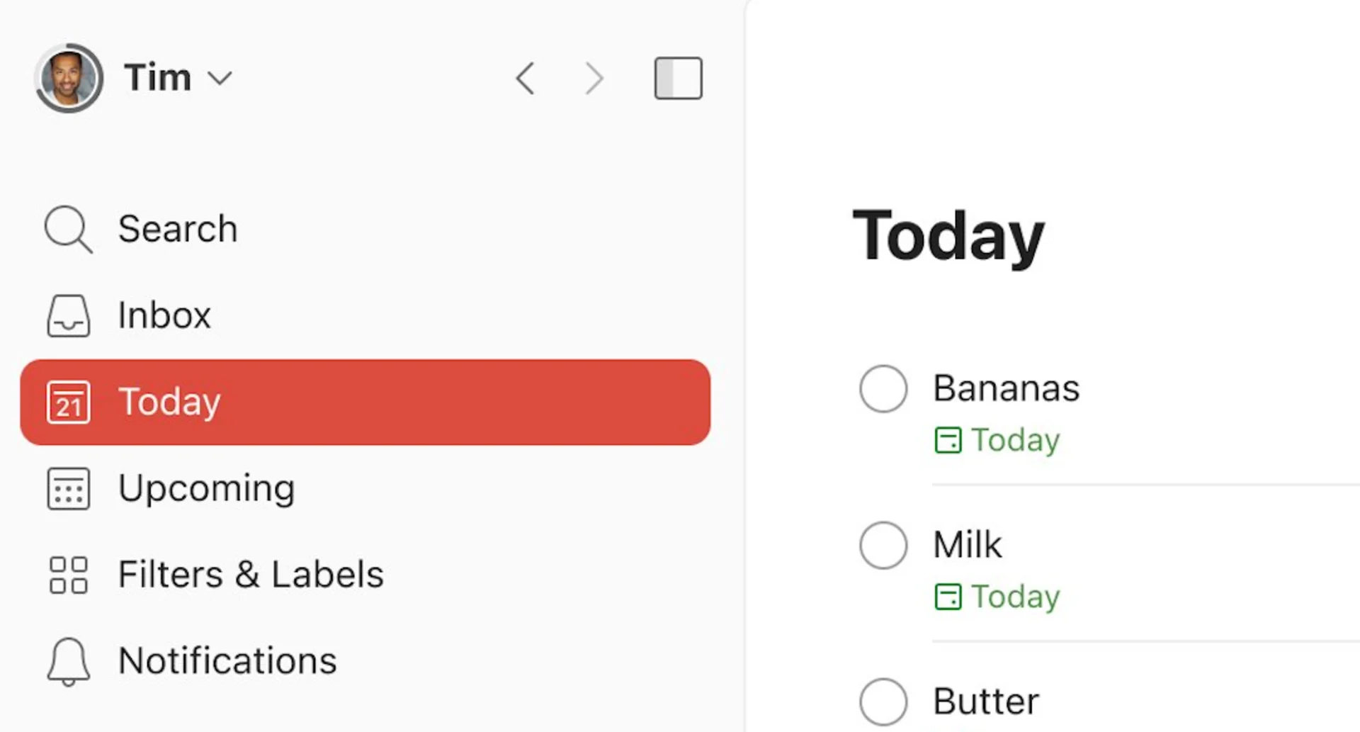
This new sidebar in the Todoist redesign will hide away mess. Keeping your Todoist karma tidy, sidebar tucked away and all your key areas available at a glance, much neater.
3. Cleaner Look
In general the full look is focused less. Less tasks, more focus on the task at hand versus a overload of information as you enter your Todoist account, even if your account has lots.
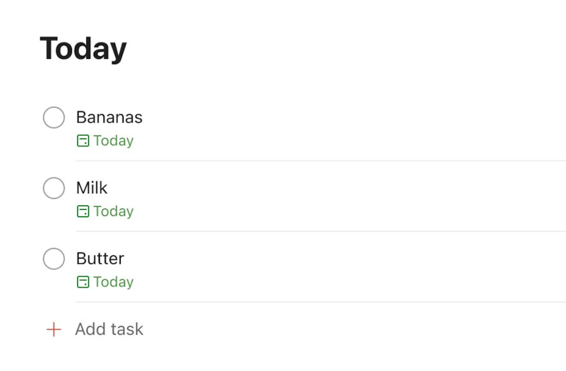
So this is the current Todoist experience right now, do you like the new changes that will be coming in a Todoist redesign. Note that this might not be the final look? Or like the former?
Explore More Productivity Apps & Software
From trending reads, trending tools and beyond


Choose from hundreds of productivity tools
View All